-
Brand Identity Development
Challenge: Develop a new brand and logo for an insurance company formed after a corporate split. The goal was to differentiate from the original flagship company while establishing a distinct identity that could also serve as the parent hub for future acquisitions. The brand positioning emphasized growth, agility, high performance, and ambition in action.
Full Campaign
My Role: I designed a bold, modern logo featuring a slanted form and fiery color palette to convey speed, energy, and forward momentum. The simplicity of the design ensured scalability across digital, print, and future sub-brands.
Result: The new identity successfully captured the company’s positioning and provided a flexible brand foundation that unified existing operations and created space for future growth and acquisitions.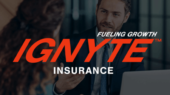
-
Brand Identity Development
Challenge: Develop a new brand and logo for an insurance program serving row crop farms, vineyards, and other agricultural businesses. The goal was to create a visual identity that stood out in a crowded market while aligning seamlessly with the parent company’s corporate brand and its portfolio of B2B programs. The brand needed to reflect the farm and ranch industry through elements such as crops, fields, and machinery.
Full Campaign
My Role: I designed a bold, vibrant logo using warm, earthy tones and strong, organic forms to evoke the farming and agricultural landscape. The design balanced approachability with professionalism, ensuring it resonated with both insurance brokers and the agricultural community.
Result: The new identity distinguished the program within its niche, captured the spirit of the agricultural community, and provided a versatile brand foundation to support marketing efforts and future growth. While the acquisition ultimately did not move forward, the branding was well received and positioned the program for success.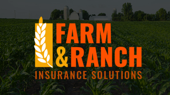
-
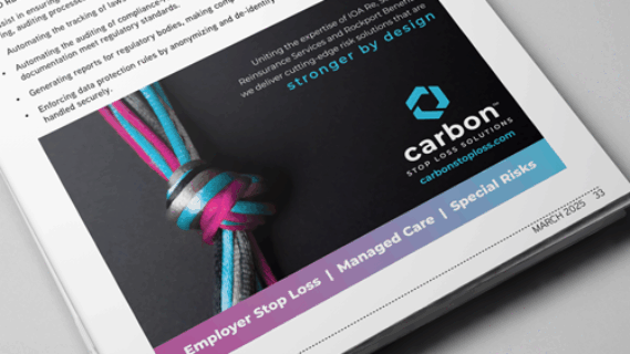
Print Ad
Challenge: Develop a print ad to announce the rebrand and unification of three entities into Carbon Stop Loss.
My Role: Designed an ad that visually highlighted the strength of the merger—clean, bold, colorful, and impactful, ensuring it stood out on the page.
Result: Increased awareness of both the acquisition and the newly established brand identity.
-
Trade Show Campaign
Concept: Develop a campaign that would break through the noise of a crowded conference, spark curiosity, and drive attendees to stop by the booth asking, “What is TSEA?”
Full Campaign
My Role: I created a multi-channel campaign built around a playful concept: a trade show “health condition” called Trade Show Eye Avoidance. This tapped into a universal attendee behavior—scanning booths for relevant information while avoiding unwanted sales conversations. The campaign highlighted the “symptoms” of this condition—nervous smiles, quick darting glances, and subtle attempts to gather details unnoticed—bringing humor and relatability to the brand’s presence.
Result: The campaign delivered measurable impact: a 42.5% increase in qualified leads and a 51% reduction in unqualified traffic compared to the previous year.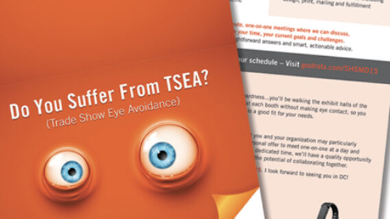
-
Trade Show Campaign
Concept: Develop a creative theme for one of our annual conferences that was held in California that would energize attendees and make the brand stand out.
My Role: Drawing inspiration from the host city, I designed a Hollywood-themed campaign that put attendees “in the spotlight,” making them feel like movie stars.
Result: The experience extended across multiple touchpoints, turning the booth into a red-carpet destination that celebrated each visitor.
Menu